All you need to know about Color Definition in Art | How to use colors in art?

Contents
Color plays a fundamental role in the world of art, serving as a powerful tool for expression, emotion, and storytelling. From the warm tones of a golden sunrise to the cool blues of a tranquil ocean, colors have the ability to evoke feelings, create depth, and guide the viewer’s eye. Understanding color definition in art is essential for artists seeking to enhance their creative work, as it provides the foundation for mastering color theory and its applications.
At its core, color definition in art refers to the way artists define, interpret, and utilize colors to convey their vision. By exploring the nuances of hue, saturation, and value, artists can create compelling compositions that resonate with their audience. Whether it’s a bold use of primary colors in abstract art or subtle gradients in realism, the deliberate choice of colors can transform a simple piece into a masterpiece.
As you dive into the fascinating realm of color definition in art, you’ll uncover its historical significance, technical aspects, and contemporary applications. Mastering this concept can open doors to limitless creative possibilities, making it an indispensable skill for any artist.
The Concept of Color Definition in Art
The concept of color definition in art revolves around the way colors are identified, interpreted, and utilized in artistic compositions to convey meaning and evoke emotions. In essence, it’s about understanding the role that color plays as a visual language, bridging the gap between an artist’s intent and the audience’s perception.
In art, color isn’t merely a decorative element; it is a dynamic tool that shapes mood, guides focus, and tells stories. By defining and analyzing the properties of color—such as hue, saturation, and value—artists can achieve greater precision in their work. For example, warm colors like reds and yellows are often used to create energy or warmth, while cool tones like blues and purples convey calm or melancholy.

Color definition in art also encompasses the deliberate use of contrast and harmony. Artists employ techniques such as complementary and analogous color schemes to balance their compositions. For instance, the stark contrast between red and green draws attention, while analogous shades like blue and turquoise create a soothing effect. These choices are rooted in an understanding of how color behaves both individually and in relation to others.
In the context of modern art, color definition in art extends to digital media and technology, where precision in color representation is vital. Digital tools allow artists to manipulate and experiment with colors in ways that were once unimaginable, pushing the boundaries of creativity.
In exploring the concept of color definition in art, artists gain the ability to create visually compelling works that not only captivate the eye but also resonate on a deeper emotional and intellectual level. It is through this mastery of color that art transcends aesthetics and becomes a profound medium of communication.
Historical Perspectives on Color
The use of color in art has a rich and varied history, reflecting cultural, technological, and philosophical shifts throughout human civilization. From the earliest cave paintings to modern digital creations, the concept of color definition in art has evolved as artists have sought to harness the power of color to express their worldviews and emotions.

Color in Ancient Art
In ancient times, color was deeply tied to natural materials and cultural symbolism. Early artists used pigments derived from minerals, plants, and earth, such as ochre, charcoal, and lapis lazuli, to create their works. In Ancient Egypt, color held sacred significance—green represented fertility and rebirth, while blue symbolized divinity and protection. These symbolic uses of color were essential in religious and ceremonial art, emphasizing the spiritual connection to their environment.
Medieval and Renaissance Color Theory
During the Middle Ages, color usage became heavily influenced by the Church. Gold and vibrant hues were used in illuminated manuscripts and stained glass to depict divine light and heavenly realms. The Renaissance period marked a turning point in color definition in art, as artists like Leonardo da Vinci and Michelangelo explored the interplay of light and shadow (chiaroscuro) and began to study the science of color. This era also saw the development of oil painting, which allowed for richer and more nuanced color application.
The Birth of Color Theory
The 17th and 18th centuries witnessed the formalization of color theory, thanks to figures like Sir Isaac Newton. Newton’s color wheel laid the foundation for understanding color relationships, such as complementary and analogous hues. Artists of this time, including Johannes Vermeer, experimented with these principles to create striking compositions that balanced harmony and contrast.
Impressionism and Modern Movements
The Impressionists revolutionized color definition in art by rejecting traditional rules in favor of capturing light and atmosphere. Artists like Claude Monet and Vincent van Gogh used bold, vibrant colors to convey emotion and movement, breaking away from the subdued tones of earlier styles. Their work emphasized the subjective experience of color, inspiring movements like Fauvism, which celebrated raw, expressive hues.
Contemporary Perspectives on Color
In the 20th century, the advent of new materials and technologies transformed the role of color in art. Abstract artists like Wassily Kandinsky and Mark Rothko explored color as a primary means of expression, detached from form or representation. Meanwhile, Pop Art icons such as Andy Warhol used color to comment on consumer culture and mass production.
Digital Revolution and Beyond
Today, color definition in art continues to evolve in the digital age. Tools like Photoshop and Procreate allow artists to experiment with millions of colors effortlessly. Innovations in color science, such as Pantone’s standardized systems, ensure consistency and accuracy across mediums. The accessibility of digital tools has democratized the exploration of color, making it an integral part of both traditional and digital artistry.
The history of color in art is a testament to its enduring power as a tool for communication and creativity. By understanding the historical perspectives of color definition in art, artists can draw inspiration from the past while shaping the future of their craft.
Elements of Color in Art
Understanding the elements of color in art is essential for mastering the craft of creating visually striking and emotionally resonant works. These elements—hue, saturation, and value—form the foundation of color theory and are critical to defining the role of color in an artistic composition. Let’s dive into these elements and their significance in color definition in art.

1. Hue: The Identity of Color
Hue refers to the name or identity of a color, such as red, blue, or yellow. It is what we commonly think of as “color” and serves as the basis for all artistic color schemes.
- Primary Colors: Red, yellow, and blue are the building blocks of all other colors.
- Secondary Colors: Orange, green, and purple are created by mixing primary colors.
- Tertiary Colors: These are a mix of primary and secondary colors, such as red-orange or blue-green.
In color definition in art, understanding hues helps artists create visual impact and convey mood. For instance, warm hues like red and yellow can evoke excitement, while cool hues like blue and green bring calmness.
2. Saturation: The Intensity of Color
Saturation, also known as chroma, defines the purity or intensity of a color. High saturation means the color is vivid and bold, while low saturation results in muted or grayish tones.
- High Saturation: Often used in dynamic compositions to draw attention or express strong emotions.
- Low Saturation: Ideal for creating subtlety or focusing attention on other elements.
Artists skilled in color definition in art often manipulate saturation to balance their compositions, create focal points, or suggest depth and atmosphere.
3. Value: The Lightness or Darkness of Color
Value refers to the lightness or darkness of a color, which is achieved by adding white (tint), black (shade), or gray (tone) to a hue.
- High Value (Light Colors): Can create a sense of airiness and openness.
- Low Value (Dark Colors): Often associated with mystery, drama, or heaviness.
In color definition in art, controlling value is crucial for creating contrast and emphasizing form. For example, lighter values can highlight certain areas, while darker values add depth and structure.
4. Color Temperature: Warm vs. Cool
Color temperature describes the emotional and visual “feel” of a color.
- Warm Colors: Red, orange, and yellow create feelings of energy, warmth, and intensity.
- Cool Colors: Blue, green, and purple evoke calm, tranquility, or melancholy.
The interplay between warm and cool colors is a key aspect of color definition in art, as it allows artists to guide the viewer’s eye and establish mood.
5. Relationships Between Colors
The relationship between colors on the color wheel is another vital element of color definition in art.
- Complementary Colors: Opposites on the color wheel, such as red and green, create striking contrast.
- Analogous Colors: Neighboring hues like blue, blue-green, and green create harmony and unity.
- Triadic Colors: Three evenly spaced colors, such as red, yellow, and blue, form a balanced yet dynamic palette.
By mastering these relationships, artists can craft compositions that feel both intentional and visually engaging.
6. Texture and Context in Color
In color definition in art, texture and the surrounding context influence how a color is perceived. For instance, a bright red will appear more vibrant when placed next to a dull gray than when paired with orange. This interplay between color and context is critical in achieving the desired effect.
By understanding and leveraging these elements, artists can take their work to new heights. The elements of color not only define the technical aspects of color definition in art but also empower artists to craft emotionally impactful and visually stunning creations.
Techniques for Using Color in Art
The use of color in art goes beyond simple application; it requires a deliberate understanding of techniques to create impactful and meaningful compositions. Artists can explore these techniques to enhance the way they convey emotion, depth, and focus in their work. Below are key techniques that play a crucial role in color definition in art:

1. Color Harmony
Color harmony refers to the pleasing arrangement of colors in a composition. Artists achieve harmony by selecting colors that work well together and evoke a specific mood.
- Analogous Harmony: Uses colors next to each other on the color wheel (e.g., blue, blue-green, green) to create a soothing, unified look.
- Complementary Harmony: Combines colors opposite each other on the color wheel (e.g., red and green) to create vibrant contrast.
- Triadic Harmony: Involves three evenly spaced colors on the color wheel (e.g., red, yellow, blue) for a dynamic yet balanced palette.
This technique is foundational in color definition in art, ensuring visual appeal while directing attention.
2. Gradation and Blending
Gradation is the gradual transition between two colors, while blending ensures smoothness in this transition.
- Soft Gradation: Creates a natural and subtle effect, ideal for skies or skin tones.
- Bold Gradation: Adds drama and impact, often used in abstract or modern art.
Mastering gradation is key to realistic and expressive color definition in art, especially in painting and digital art.
3. Color Blocking
This technique involves using large, flat areas of solid color to define shapes and add structure to compositions.
- Simple Blocking: Employs bold, single-color sections to emphasize clarity and focus.
- Complex Blocking: Uses overlapping blocks of varying shades for depth and interaction.
Artists in movements like Fauvism and Pop Art often use color blocking to make statements and draw attention.
4. Layering and Glazing
Layering involves applying multiple translucent or opaque layers of color to build richness and depth.
- Glazing: A thin, transparent layer of paint applied over a dried layer to subtly alter its hue or tone.
- Scumbling: A dry, textured layer of paint applied over an existing one for a rough, tactile effect.
These techniques are common in traditional color definition in art to achieve a sense of realism or texture.
5. Highlighting and Shading
Highlighting and shading help define form and add dimension by manipulating light and shadow.
- Highlights: Bright areas that simulate light hitting a surface.
- Shadows: Darkened areas that create depth and contrast.
In color definition in art, these techniques are vital for creating the illusion of three-dimensionality.
6. Using Warm and Cool Colors
The deliberate use of warm and cool colors can shape the emotional tone of a piece.
- Warm Colors: Evoke energy, excitement, or warmth (e.g., red, orange, yellow).
- Cool Colors: Induce calm, serenity, or melancholy (e.g., blue, green, purple).
Artists can create contrast and balance by juxtaposing warm and cool colors, a hallmark of effective color definition in art.
7. Understanding Color Context
Colors are perceived differently depending on their surroundings.
- Simultaneous Contrast: Colors appear more vibrant when placed next to their complements.
- Contextual Influence: A single color can look different depending on adjacent hues.
Artists in color definition in art leverage these effects to manipulate perception and guide the viewer’s eye.
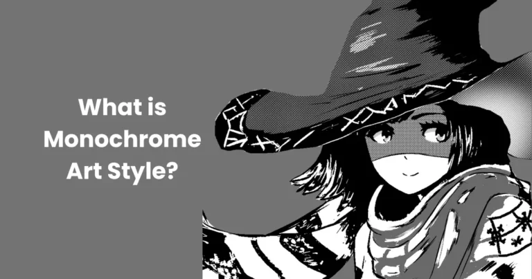
8. Monochromatic Technique
This approach uses varying tones of a single hue to create a cohesive yet visually engaging piece.
- Subtle Variations: Add depth without overwhelming the viewer.
- High Contrast: Use light and dark tones for drama and clarity.
Monochromatic palettes are often used in minimalist and abstract color definition in art.
9. Splattering and Dripping
Techniques like splattering and dripping paint are used to create spontaneous, energetic effects.
- Controlled Splattering: Adds texture while maintaining the composition’s focus.
- Random Dripping: Suggests movement and chaos.
These techniques are popular in abstract and experimental color definition in art.
10. Optical Color Mixing
This technique relies on the viewer’s eye to blend small dots or strokes of color into a unified image.
- Pointillism: Using tiny dots of color that mix optically from a distance.
- Hatching: Overlapping strokes to create an illusion of blended color.
Pioneered by artists like Georges Seurat, optical mixing remains a fascinating aspect of color definition in art.
By mastering these techniques, artists can elevate their use of color, transforming simple compositions into powerful visual narratives. In color definition in art, techniques are the key to unlocking the full potential of color as a creative medium.
Color Definition in Digital Media
With the rise of technology, color definition in art has expanded into digital media, offering artists a versatile and dynamic platform to explore, create, and innovate. Digital tools have revolutionized how color is perceived, manipulated, and applied, making it a pivotal aspect of modern artistic practices.

1. The Role of Color in Digital Art
Color in digital art serves the same fundamental purposes as in traditional media: to convey emotion, establish focus, and build composition. However, digital platforms offer unprecedented control and precision.
- Real-Time Adjustments: Artists can experiment with hues, saturation, and brightness instantly.
- Non-Destructive Editing: Tools like layers allow modifications without compromising the original artwork.
- Color Palettes: Pre-designed palettes streamline the selection process, ensuring consistency.
These advantages make color definition in art more accessible and customizable in the digital realm.
2. Tools for Color Definition in Digital Media
Modern software provides a wealth of tools for managing and applying color. Popular platforms include:
- Adobe Photoshop and Illustrator: Equipped with features like gradient maps, blending modes, and precise color adjustment tools.
- Procreate: A favorite among digital illustrators for its intuitive interface and rich color options.
- Blender and Cinema 4D: 3D modeling programs that incorporate advanced color grading and texturing capabilities.
Each tool enhances the creative process, allowing digital artists to refine their approach to color definition in art.
3. Techniques in Digital Color Application
Digital media opens the door to a wide range of techniques for implementing and experimenting with color.
- Gradient Mapping: Adds depth and complexity by blending multiple colors seamlessly.
- Color Grading: Alters the mood of an artwork by adjusting overall tones and hues.
- Dynamic Lighting Effects: Simulates real-world lighting for enhanced realism and depth.
These techniques are integral to modern color definition in art, bridging the gap between traditional and digital artistry.
4. Benefits of Digital Media for Color definition in art
Digital platforms offer unique benefits that traditional media cannot replicate:
- Flexibility: Artists can undo mistakes or make adjustments without starting over.
- Precision: Tools like color pickers ensure exact matches for hues and tones.
- Scalability: Digital art can be resized without losing quality, making it ideal for both small and large-scale projects.
- Accessibility: A vast array of digital resources, such as online color libraries and tutorials, empower artists of all skill levels.
These features elevate color definition in art, enabling creators to push boundaries and explore new possibilities.
5. Challenges of Color in Digital Media
While digital media offers many advantages, it also presents challenges, particularly in color accuracy:
- Monitor Calibration: Colors can appear differently on uncalibrated screens, leading to inconsistencies.
- File Format Issues: Saving in the wrong format can compromise color quality.
- Over-Reliance on Software: While tools are helpful, relying too much on automation can stifle creativity.
Overcoming these challenges is key to mastering color definition in art in digital contexts.
6. Future Trends in Digital Color Art
The future of color definition in art in digital media is being shaped by technological advancements:
- AI and Machine Learning: Tools that suggest optimal color combinations or automate shading and blending.
- Virtual and Augmented Reality: Expanding the role of color into immersive, interactive spaces.
- Real-Time Rendering: Enhances the accuracy and detail of color in 3D environments.
As these technologies evolve, they will continue to transform the way artists approach color in digital media.
Digital media has revolutionized color definition in art, offering unparalleled opportunities for creativity and precision. By embracing digital tools and techniques, artists can redefine the role of color in their work, paving the way for innovation and artistic growth.
Case Studies: Masterpieces Defined by Color
Color has played a pivotal role in many iconic artworks, shaping their impact and legacy. By examining masterpieces where color is the central element, we can gain insights into how artists use hues, tones, and contrasts to evoke emotions, tell stories, and challenge perceptions. Here are some notable examples of color definition in art in history:

1. Vincent van Gogh – Starry Night
Year: 1889
Medium: Oil on canvas
Vincent van Gogh’s Starry Night is a vivid exploration of color’s emotional power. The swirling blues of the night sky, contrasted with the warm yellows of the stars and moon, create a sense of movement and wonder.
- Color Symbolism: Blue represents calm and introspection, while yellow signifies hope and energy.
- Technique: Van Gogh’s use of impasto (thick paint application) enhances the texture and vibrancy of the colors.
This masterpiece exemplifies how color definition in art can transform a simple night scene into an emotional journey.
2. Claude Monet – Impression, Sunrise
Year: 1872
Medium: Oil on canvas
Monet’s Impression, Sunrise is the painting that gave rise to the Impressionist movement. Its soft, blended colors capture the fleeting beauty of a sunrise over the harbor.
- Focus on Light: Monet uses a palette dominated by oranges, blues, and grays to replicate the effects of light on water.
- Color Harmony: The complementary colors (orange and blue) create a balanced yet striking composition.
This work demonstrates how color definition in art can convey atmosphere and mood rather than precise details.
3. Pablo Picasso – The Old Guitarist
Year: 1903–1904
Medium: Oil on panel
Part of Picasso’s Blue Period, The Old Guitarist is defined by its monochromatic blue palette, which reflects themes of poverty and despair.
- Monochromatic Scheme: Variations of blue dominate the composition, emphasizing melancholy.
- Contrast: The muted tones of the figure contrast with the brighter hues of the guitar, drawing focus to the central element.
Picasso’s use of limited color showcases the emotional depth achievable in color definition in art.
4. Mark Rothko – No. 61 (Rust and Blue)
Year: 1953
Medium: Oil on canvas
Rothko’s abstract expressionist works are known for their bold color fields. In Rust and Blue, large rectangular blocks of color seem to float, creating an immersive experience.
- Simplified Forms: Rothko eliminates details, allowing viewers to focus solely on the interaction of colors.
- Psychological Impact: The juxtaposition of warm (rust) and cool (blue) tones evokes contemplation and introspection.
This piece highlights the power of minimalism in color definition in art, where color itself becomes the subject.
5. Wassily Kandinsky – Composition VII
Year: 1913
Medium: Oil on canvas
Kandinsky, a pioneer of abstract art, viewed color as a tool for expressing emotions and spiritual ideas. Composition VII is a riot of colors and forms, intended to evoke a symphonic experience.
- Dynamic Palette: Bold reds, blues, yellows, and greens interact energetically.
- Emotional Resonance: Kandinsky believed each color carried a unique emotional and spiritual meaning.
This masterpiece underscores how color definition in art can transcend visual representation and delve into abstract concepts.
These case studies illustrate the diverse ways artists harness color to define their masterpieces. From emotional depth to visual harmony, color definition in art is a universal language that continues to inspire and captivate audiences.
Conclusion
Color is the soul of art, shaping its ability to convey emotions, tell stories, and capture attention. From the historical use of pigments in cave paintings to the sophisticated techniques of modern digital media, color definition in art has evolved as a powerful medium of expression. Artists have consistently harnessed the psychological and symbolic meanings of color to communicate with viewers on a deeper, more intuitive level. The interplay of hues, contrasts, and tones has the power to evoke joy, melancholy, energy, or tranquility, making color an indispensable element in the artistic process.
As we navigate a world increasingly dominated by technology, the role of color continues to expand, particularly in digital media and contemporary practices. From the masterpieces of Van Gogh and Matisse to the interactive installations of Yayoi Kusama, color definition in art serves as a testament to the boundless creativity and innovation of artists. By understanding and mastering the principles of color, artists can push the boundaries of their craft, creating works that resonate across cultures and eras, and leaving a lasting impact on audiences worldwide.